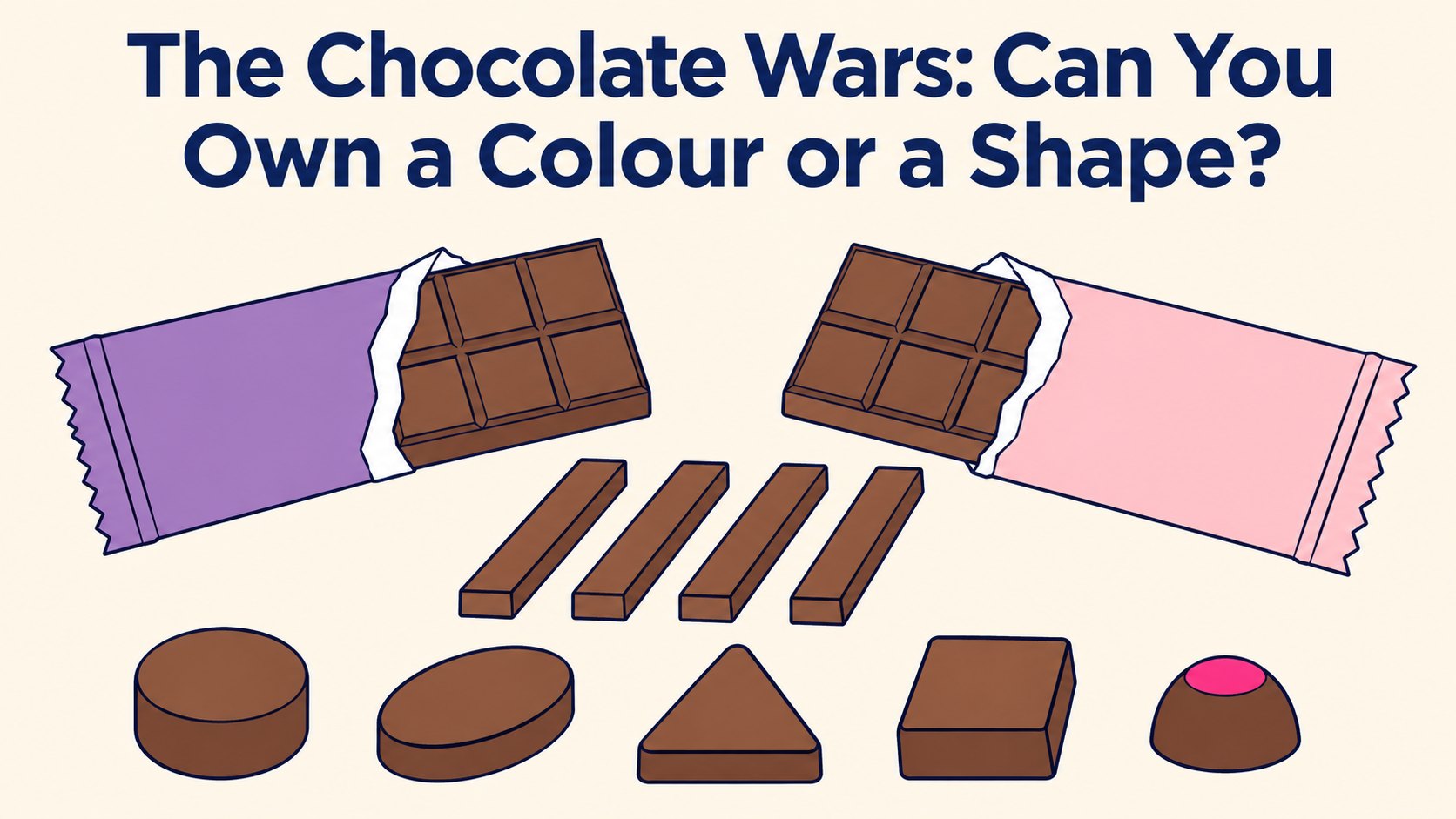
Picture a bar of Cadbury Dairy Milk. Chances are you saw purple before you saw the name. Now picture a KitKat with the wrapper off. You’d probably know it straight away.
Both companies tried to turn that instinct into a trademark. Cadbury wanted its shade of purple for chocolate. Nestlé wanted the four-finger shape of the KitKat. Between them they spent the best part of twenty years in the UK courts finding out how far trademark registration can stretch. Here, I want to talk about what it means for a business that isn’t a household name.
Cadbury’s purple: it wasn’t the colour, it was the wording
Cadbury applied in 2004 to register a specific purple, Pantone 2685C, for chocolate. The problem wasn’t that a colour can’t be a trademark. It can. The problem was the description, which said the purple covered the whole visible surface of the packaging or was the “predominant” colour on it.
That one word sank it. In 2013 the Court of Appeal refused the application, because “predominant” meant the mark could take on countless different looks, with other colours and materials alongside the purple. A trademark has to tell competitors exactly what’s protected, and this didn’t.
Cadbury then tried to delete the same wording from an older purple registration. In 2018 the Court of Appeal said no: you can’t rewrite a registered mark into a better one after the event.
Then came the twist. In 2022 the High Court looked at newer applications and drew a line. The purple described simply as a Pantone colour, in itself, could be a valid sign. The purple described as “applied to packaging”, without saying how, still couldn’t. Same colour, same company, different words, different result.
So the headline “Cadbury lost its purple” is only half true. What Cadbury really lost was a fight about wording.
KitKat’s four fingers: recognised isn’t the same as relied on
Nestlé’s problem was different. It applied to register the plain shape of the four-finger bar, without the embossed name. It had the sales, the advertising and a survey showing around half of people recognised the shape as a KitKat. That still wasn’t enough. In 2017 the Court of Appeal upheld the refusal.
The test, settled after the case went to Europe’s top court, is whether people rely on the shape alone to tell them who made the product. Recognising it isn’t the same thing.
It’s a bit like recognising a footballer by the way he runs. You might be right nine times out of ten, but you’d still check the name on the back of the shirt. With chocolate, the name on the wrapper is doing that job, which is exactly why the shape on its own struggled.
Nestlé had been here before, too. The plain Polo mint shape and “Have a Break” on its own both ran into trouble years earlier. Fame is a head start, not a finish line.
What this means if you’re not Cadbury
Most businesses don’t have twenty years and a legal budget to match. But the same questions come up whenever a colour, a bottle, a jar or a product shape starts to feel like “the brand”.
Which feature actually tells customers it’s you? Often it’s the name or logo, even when the colour gets the attention. If your customers would still check the label, the label is your trademark.
What exactly would you be claiming? A colour, a colour in a fixed place, a shape, and a logo that contains them are different signs. Each needs its own description and its own evidence. Wording that feels flexible to you can look vague to everyone else, and that’s the Cadbury lesson in one sentence.
Is anyone else entitled to use it? If a shape or colour is practical, or common in your market, competitors may need it, and no amount of advertising changes that.
Is a trademark even the right tool? The look of a product can sometimes be protected by design registration. It’s a separate right with its own rules and time limits, and it’s often a better fit for a shape than a trademark.
What I’d take from it
- You can trademark a colour or a shape, but recognition isn’t the test. Customers have to rely on it to know who’s behind the product.
- The words in the application matter as much as the colour or shape itself. You can’t fix them afterwards.
- Protect the name, logo and tagline first. It’s why the biggest brands register them separately rather than as one combined mark.
- Then decide, with evidence, whether a colour, shape or product design deserves its own protection.
The application is the easy bit. Deciding what to apply for is where the value sits. A trademark consultation and clearance audit looks at which parts of your brand carry real weight. From there, we can handle the UK trademark registration or trademark your logo in the right order.
If you’d like to talk through a colour, shape or packaging you think might be worth protecting, book a free call, email enquiries@thetrademarkhelpline.com or ring 0161 833 5400. Where regulated legal advice is needed, we coordinate help through our trusted panel of regulated partners.
This article is for information purposes only and does not constitute trademark advice or guidance. Last reviewed 3 November 2026.